
From Pen to Pitch: Creating the Atlético London Crest
A football club’s crest is more than a symbol; it reflects identity, ambition and the story a club chooses to tell about itself. For us, creating the badge was never simply about designing something that looked good on a shirt. From the beginning, the goal was to build an identity that felt personal and meaningful to the people who would wear it, support it and join us for the journey.
The design process was led by our Head of Brand Strategy, Marcus Dilley, who approached the crest with a clear principle in mind: strong design should carry meaning. When a badge reflects identity and purpose, it creates a deeper connection with the people who engage with the club.
As Marcus explains, storytelling sits at the centre of thoughtful design: “Even when a club is new, the identity should still feel connected to something bigger because when there’s a story behind the design, people recognise it and feel a part of it.”
THE MONOGRAM COIN
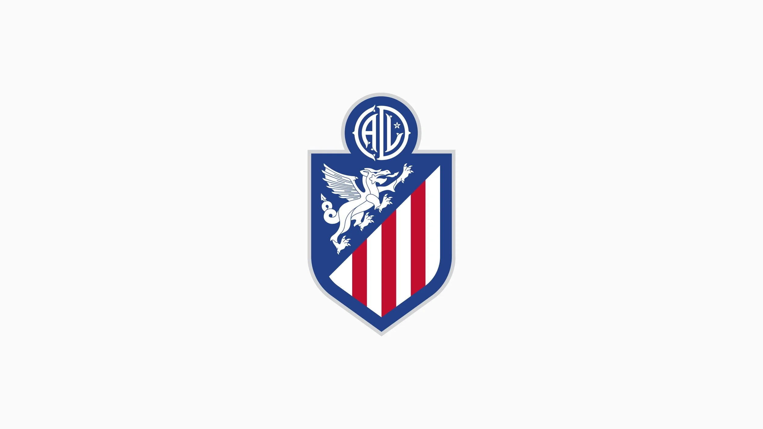
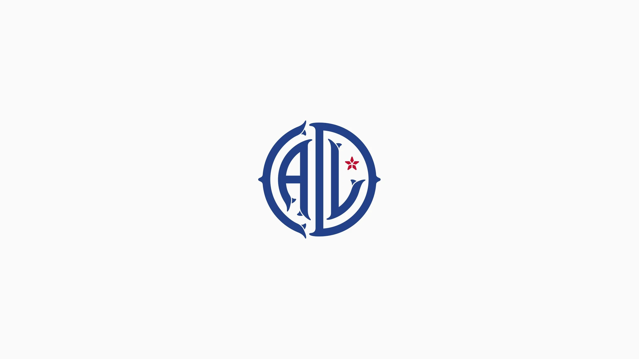
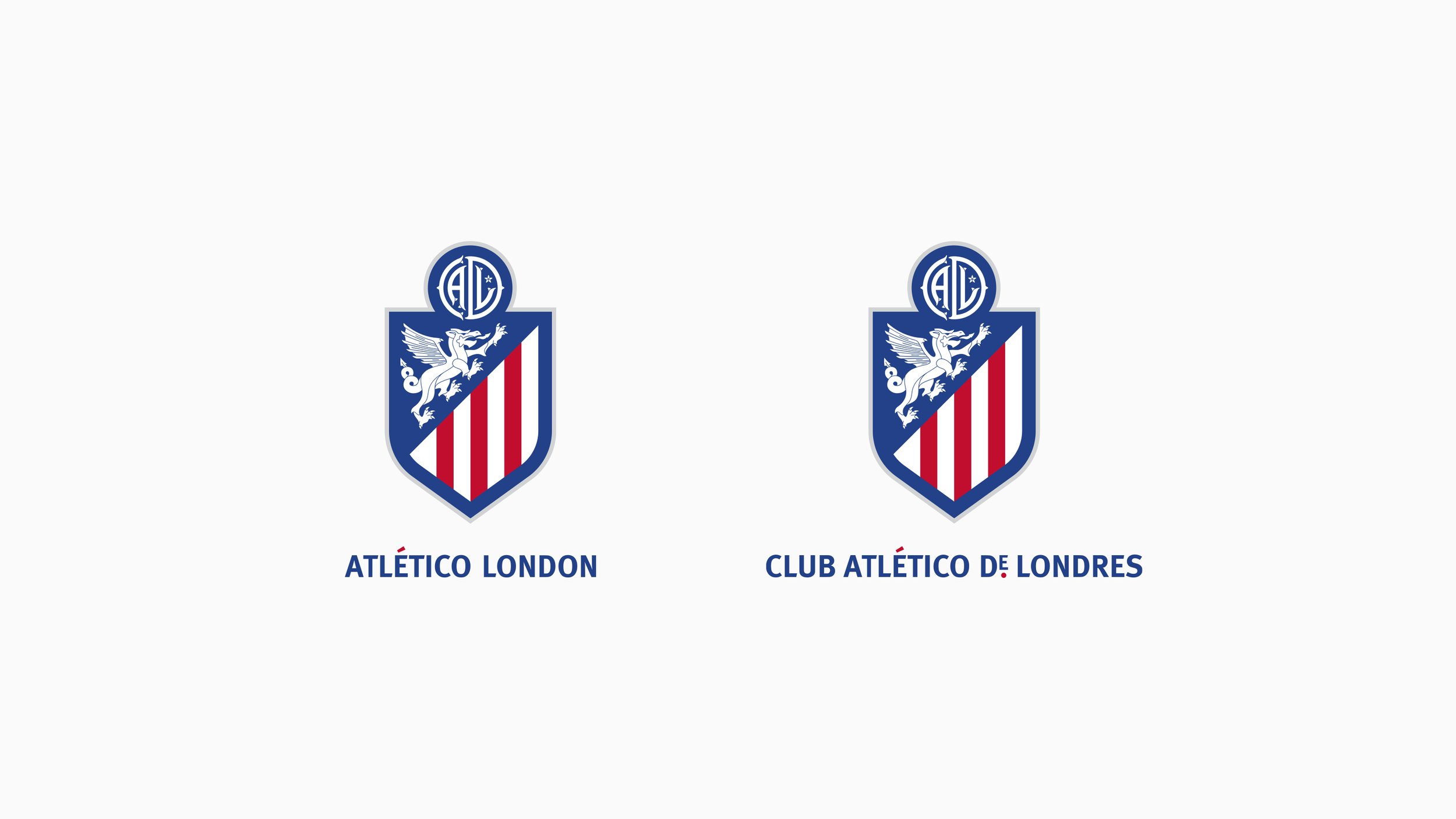
At the upper centre of the crest sits one of its most distinctive details: a coin featuring the CADL monogram, representing our Spanish name, Club Atlético de Londres.
The monogram takes inspiration from an ancient London coin minted by Alfred the Great in the ninth century. Among the earliest to bear the name Londinium,it was issued following Alfred’s recapture of London from Viking rule. It marked an important moment in the city’s history, symbolising unity and the re-establishment of London as a centre of power and culture.
In developing this element, Marcus looked to the tradition of football monograms used across the game, particularly in the Spanish speaking parts of the world like South America, where clubs have long incorporated their initials into distinctive, interlocking marks. This influence helped shape the CADL mark into a symbol that could stand confidently on its own.
Marcus identifies the coin monogram as one of his favourite details: “It’s a detail that can stand on its own,” he explains. “We could see it appearing on a cap or a sweatshirt and still being clearly recognisable as part of the club.”
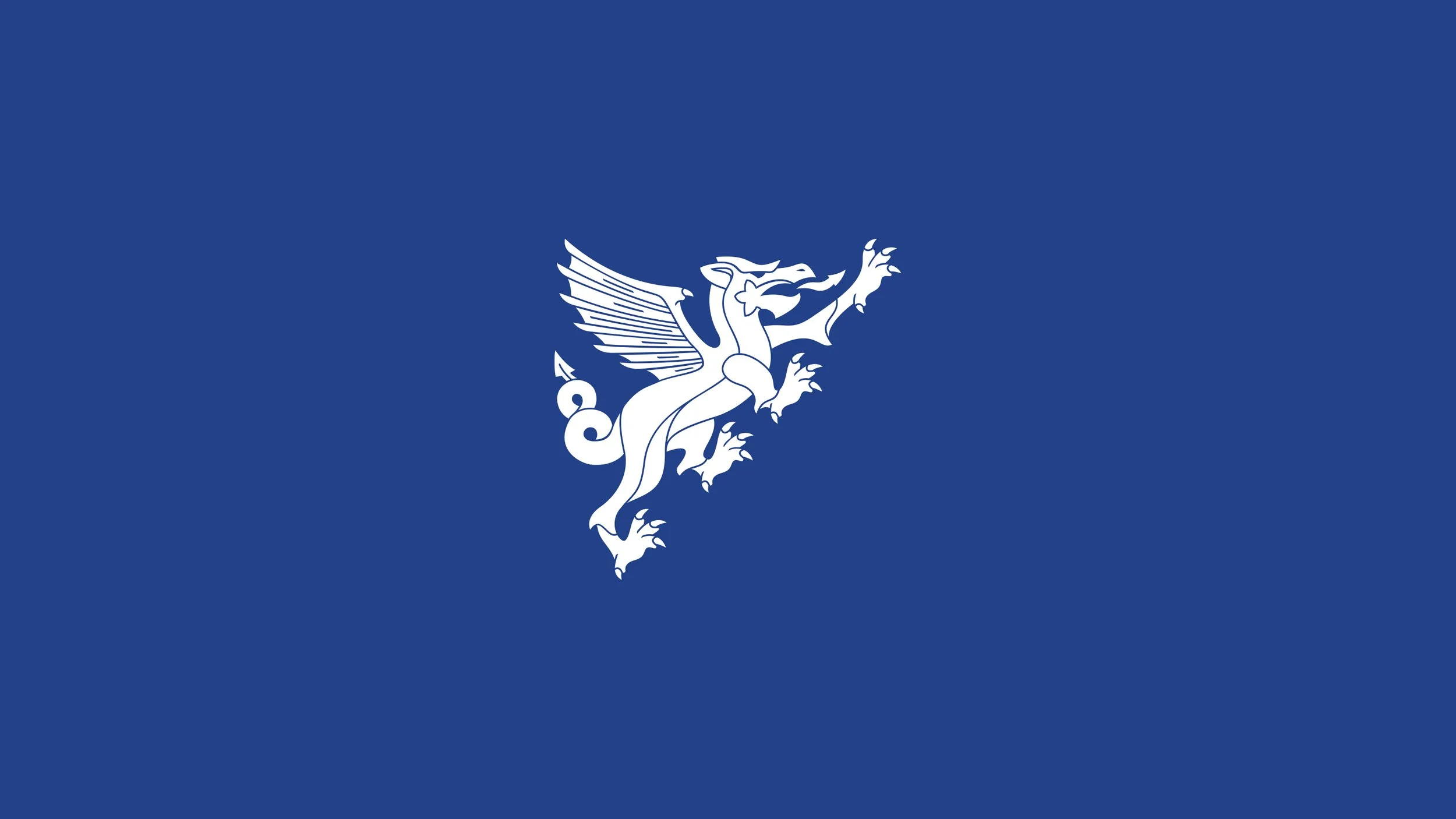
THE WHITE DRAGON
Another defining feature of the crest is the white dragon, drawn directly from the coat of arms of the City of London. Traditionally depicted as a guardian figure, the dragon symbolises strength and protection. The version used in the crest includes several details found in the city’s heraldry, including the double-looped tail, scale detailing around the mouth and the St George’s Cross displayed on the dragon’s wing. These elements help anchor the badge firmly in London’s history.
Arriving at the final design was a careful process, Marcus reflects: “The dragon was probably the element we spent the most time refining. It had to feel authentic to London’s heraldry, but it also had to sit naturally within the shape of the crest. We went through almost 40 iterations before we found a version that felt balanced.”
TYPOGRAPHY
Typography plays a vital role in the club’s identity. Our brand font is a humanist sans serif, a style closely associated with London’s typographic heritage. These typefaces reflect the rhythm and proportions of handwritten forms and have shaped much of the city’s public signage throughout the twentieth century.
The most famous example is the Johnston typeface, designed for the London Underground in 1916, which helped define the visual language of the city. In the Spanish version of our wordmark, the stylised “De” also includes subtle detailing inspired by the industrial lettering historically used in London’s docklands.
Beyond these historical roots, a strong, recognisable brand font can itself become an identifier. Over time, simply seeing text set in the typeface can be enough for people to associate it with Atlético London, even without the logo. Establishing this recognisability takes time, but once it is understood, the font carries the club’s identity subtly and consistently.
CREATING A NEW IDENTITY
Building a thoughtful identity was especially important for us as an independent women’s club. Without inheriting an existing badge or identity from a men’s team, we had the opportunity to approach the design with a fresh perspective. “Being independent allows you to think differently,” Marcus says. “You’re not tied to an existing identity, which means you can create something distinctive from the start.”
The result is a crest that brings together inspiration from football’s wider culture with symbols rooted in London’s history. More than anything, it reflects the same idea that underpins Atlético London itself: building something intentional, thoughtful and meaningful from the very beginning.